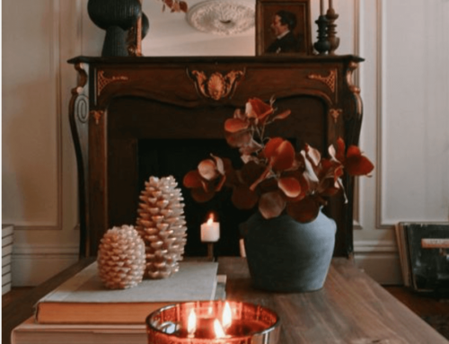

September is often a time of transition and growth when it comes to business, individual focus, families, and of course, Interior Design! This is a time of year when mornings start out cool and crisp and give birth to deeper blues and reds in the sky. I love Fall for the changes in nature, and especially the seasonal cues of russet leaves and emerald forests, but also the comfort and warmth of our homes and aromas that return in the autumnal air.
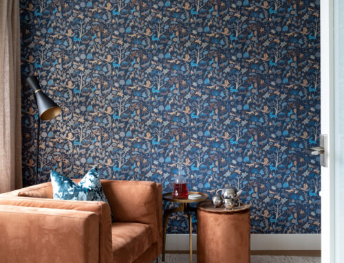
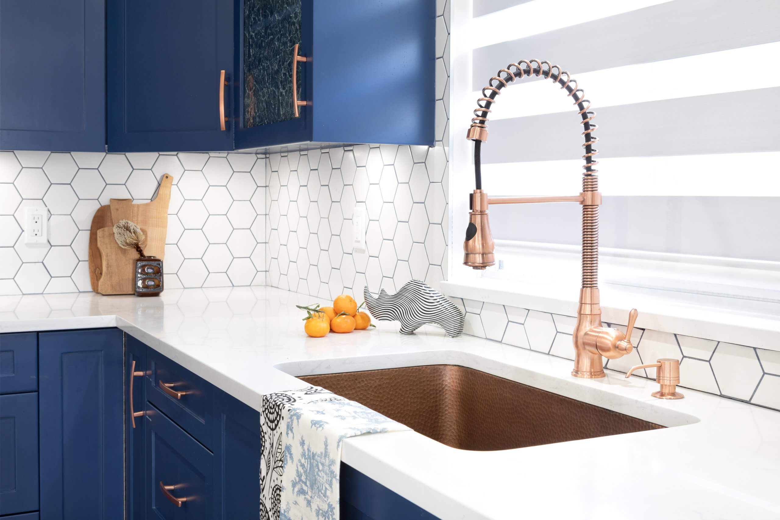
I have always been a fan of colour, so I am really pleased that more and more vibrant and intense colour is returning to our interiors! I want to encourage you if you’re a bit nervous about stepping out of a neutral world into one of colour – it is invigorating and fresh, and can also be moody and dramatic. Dark walls in hues of charcoal, navy and emerald have made a comeback! Shades of crimson, ochre and aubergine are a hit for the more adventurous and avant-garde! Are you ready to tell your colour story?

What spurred all this fascination? My recent holidays in Bolivia, Chile and Peru, were a feast for the eyes when it came to the painted adobe architecture, handmade and hand-dyed textiles, natural lay of the land with coral and cinnamon coloured earth, towns and villages set deep into the hillsides and the layers and history of traditional clothing and costume worn by indigenous and locals alike. There is a sense of pride as well as humility in the everyday beautiful and I have come away with a new appreciation for the bold and playful woven literally into the fabric and the history of these diverse countries.

Do you ever stop to think about how colour impacts your everyday mood? Have you figured out what colours speak to you- and know what works both in your home but also in your wardrobe and working environment? Another question: Are you satisfied with existing colour choices in your home and are you confident that these colours align with your personality and aesthetic? Some food for thought!

Colour Story ‘Hacks’…
- Adding neutrals tints of white (+light), shades of black (+dark), and tones of gray (+ slightly dark) to your primary colours will change the colour but still keep them in same family.
- Using Temperature with colour is choosing warm colours of red, orange and yellow to cool colours of blues, purples and greens. TIP: Use warm colours in a larger space and cooler colours for contrast.
- Complimentary colours (opposite colours on colour wheel) should be done with a neutral backdrop so that your eye can find places to rest.
- Using 3 colours in a row (from the colour wheel) is called an Analgous Colour Scheme. Use the rule of 60-30-10 in proportion to shade from dominant to one of support and then one to accent.

Do you have a colour story and strategy you’d like to implement? Would you like to learn more? As always, I am here to help! If you are in a colour slump and have been painting walls in myriads of colour schemes to no avail, or you want to purchase a statement aubergine chaise lounge in just the right hue, and custom is the answer- then consider how colour impacts you in your world! Make the decision to contact a professional (me!) to guide you through the process of choosing the right colour story for YOU! (Did you know that in another life I worked at Benjamin Moore Paint? Haha! It is true!) And quite naturally I have a very good eye when choosing colours!! So give me a call and we will write your colour story together!